8 Principles Behind High Converting Landing Page Design
Menu Icon

How Good Design creates High-Converting Landing Pages

Defiant Digital Logo
A landing page is arranged by a fundamental group of elements. These foundational blocks should be used as a guide when designing and creating your content.

But there’s no need to reinvent the wheel here, after all, good marketing is all about being a cut above the rest and standing out.

And today we’re going to dissect the science that is high- converting landing pages.

Picasso said, “Learn the rules like a pro, so you can break them like an artist.”

The secret behind why landing pages convert so well is because they’ve got the fundamentals down, no matter the end conversion goal or their intended audience or the price point of what they’re offering. And no matter the creative campaign you’re running. The structure of a landing page is positioned to persuade leads and the elements help carry them over the conversion line.

By understanding the building blocks of a landing page and sticking to this guide, you’ll almost guarantee conversions. This opens the door to optimising your page to continually stay ahead of the curve.

So what is a landing page and what does art have to do with it?

It is an independent web page that potential customers reach after clicking a promotional URL in an ad, a social media post or search engine result, etc… With one design goal in mind, to get its visitors to convert.

The conversion goals could be anything from collecting your details for a free consultation or your email to subscribe to an email newsletter. To achieve that intended outcome, your post-click landing page should leverage psychological principles, colour theory, UX best practices and so much more…

The Winning Components of a Landing Page

Each landing page is a snowflake of design, Unique. However, there are 7 core elements that every high converting page must have:

  1. A unique selling proposition (USP)
  2. Throat grabbing Headline/Sub-headline
  3. Eye-capturing hero creatives
  4. Concise copy that outlines the benefits of your offer
  5. Some form of social proof
  6. No “drop off points”
  7. Keep that loading speed super quick
  8. The strongest conversion goal that’s ever existed (your call to action)

7 Winning Components of a Landing Page


1. Your Unique Selling Proposition

Your USP is the diamond in the rough that sets your product or service apart from your competition. It’s the answer to the customer’s question, “ What makes this offer so outstanding?”

Your uniqueness will only get you so far. Think of your USP as how you position your offering as special & better than all the rest.

The communication on your landing page must be clear and to the point so that your visitors immediately understand why your product or service is so enticing.

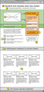
2. Headline/Sub-headline

The headline is the first thing that your visitors will read. So it’s vital that it very clearly announces what a visitor is expected to get from your product or service. Keep your headline zesty and direct about your USP- keep the fluffy poetic stuff for your personal notes.

Since the headline is brief and direct, the supporting headline is where you can embellish with a little extra information. A sub-headline can take two approaches:

It can act as a direct extension of the headline, like a call and response act. (The headline should act as the main character. Or it can offer additional value or convey a secondary persuasive message that’s still related to the headline.

3. Eye-Capturing Hero Creatives

As humans and visual art has evolved, so has our ability to process them. We can process visuals 60,000 times faster than text, and such first impressions are crucial when visitors first arrive on your landing page.

Forget the use of generic stock images, invest in using a “hero shot” to tease them how your product or service will change their lives for the better.

A short explanatory video of how your product works, focussing on how it will benefit your prospects is just as tasteful.

A winning ingredient to use in these creatives is using genuinely satisfied customers in your photo or video. This kills two birds with one stone by explaining your product/service and doubling as social proof.

4. Concise copy that outlines the benefits of your offer

 Your landing page needs a message matched copy following the headline to persuade most site visitors and convert them to prospects. The trick here is to describe specific benefits paired with features. Like our short and succinct headlines, the messaging of our copy should be snappy and easily digestible.

The recommended length shouldn’t be longer than two or three consecutive sentences of block text or a direct listing of benefits that sets your product/service apart.

For example, if we were advertising noise-cancelling headphones, we wouldn’t talk about the various colours or the multitude of materials used. We’d talk about the unrivalled sound quality, 30hr long battery life, controllable noise cancellation, reliable Bluetooth connection etc..

As mentioned previously, every landing page is unique. That also means the copy. Depending on the product and its price point or complexity, it might require a lengthier explanation.

5. Social Proof

If you’re like most people then before buying a product or service, you ask friends and family, to see just how good that air fryer is or that new gym app subscription before you fork out that hard-earned dough and regret your purchase.

This translates in the online space too.

92% of people value recommendations from a peer & 70% of people trust a recommendation from someone they don’t even know.

So why does that matter for the post-click landing page?

Using social proof will influence your prospects and boost the probability to click on your CTA button tenfold. Social proof is unmistakably the strongest tool in your arsenal when creating high converting landing pages, so here’s a few examples of how to correctly execute it.

On a landing page, your social proof can take many forms:

  • Direct quotes from customers
  • Case studies (or links to case studies)
  • Video interviews or testimonials
  • Logos of customer companies
  • Review scores from sites like Google, Amazon, or Facebook
  • Authority badges

Theragun uses social proof through influencer marketing testimonials, Authority badges of respected magazines and awards and direct quotes from such publications.

Landing page 1
Landing page 2

Get specific. Get names, numbers, fact-driven results from happy customers that are speaking on behalf of your business. The more you can display about them, the more trustworthy they seem to your visitors.

6. No “drop-off” points 

If you have a bucket with a bunch of holes in the bottom of it, it’s not really going to hold much water in it, is it?

That is what links are to a landing page.

Escape points.

Your landing page is the bucket; optimised for the end goal: conversions. And too many links are those holes, pouring your leads into new tabs and distracting escape routes away from the conversion goal.

I urge you to resist the temptation to add unnecessary links such as social media buttons, site navigation, additional calls-to-action or even links back to the homepage. All of these are just another hole in the bucket that your prospects can escape through.

And if you think that they’ll open a new tab, browse around and then come back to your landing page, you’re surely dreaming. The average attention span on a website is 8 seconds. You want to make your landing page as airtight and externally link free as possible.

Apart from the privacy policy and terms and conditions, I recommend no other links to be found on your post- click landing page.

7. Fast loading speeds = Faster conversions

According to page speed reports by Unbounce, they show that 70% of consumers admit that loading time influences their desire to buy. If your pages are taking more than 3 seconds to load on a mobile device, you’re going to lose a lot of potential customers. (Source: Page Speed Report for Marketers)

Statistics by Hubspot show that the first five seconds of page-load time have the highest impact on conversion rates. Website conversion rates drop by an average of 4.42% with each additional second of load time. (Source: https://www.hubspot.com/marketing-statistics#)

Avoid loading your loading page with too many elements. Everything on there should have an intended purpose. Make sure images, videos and all your other content has been optimised.

If your landing page is still slow, follow Google’s Accelerated Mobile Pages (AMP) steps to produce lighting fast speed times.

8. The Call-to-Action

The throat grabbing headline, compelling copy, the satisfied customer testimonials and optimizations are the recipe for one thing: to get your prospects to click on that call-to-action button.

This landing page element should jump out to your visitors almost instantly when they land on your page.

It doesn’t mean make it obscenely large they can’t miss it or a ridiculous bright pink or orange.

Using The Fundamentals of Color Theory we can psychologically hack our visitors brains and perception to automatically resonate with the brand through colour.
Find the right shade, gradient, tint or tone that stands out from the rest of your page.

As far as the copy of your CTA, don’t settle for bland or boring. Spice it up to message-match what your advertising says.

For example, if you’re a finance broker advertising low interest rates, you want all the information possible to make the right decision before making a large finance decision. A CTA like “Get Free Expert Advice Today” gives prospects the assurance they’ll get all the information they need to make that decision.

Most importantly, make sure that button LOOKS like a button. Your visitors should know they need to click on your CTA to get the value from your offer otherwise poor design could lead to, well no leads.

Conclusion

Remember this is just the skeleton fundamentals to designing a high- converting post- click landing page. Constantly iterating and optimising the elements above will produce varied results for your individual business. The best way to find out what works and what doesn’t is continually A/B testing each page to find the winning formula to your perfect landing page.

Don’t waste time thinking about this epic advertising trend, start introducing these fundamentals within your landing pages. If you need a digital marketing agency in Sydney to design, implement and grow your business then contact Defiant Digital.

Defiant Digital is the leading source of strategy and insight serving DTC ecommerce businesses. From agency services to educational resources for ecommerce leaders and marketers, Defiant is committed to helping you do your job better.

For more content like this, sign up for our newsletter, listen to our podcast, or follow us on YouTube or LinkedIn.

Let's Work Together

DEFIANT DIGITAL
DEFIANT DIGITAL

Author

DefiantShape

Enjoy the read?

Share

Defiant Icon

Have your say